The Business
Reality
Bluamp Energy operates in a high-stakes category. Lithium-ion batteries and solar infrastructure are long-term investments, not impulse purchases. Buyers in this space evaluate stability, engineering credibility, and long-term performance before making decisions.
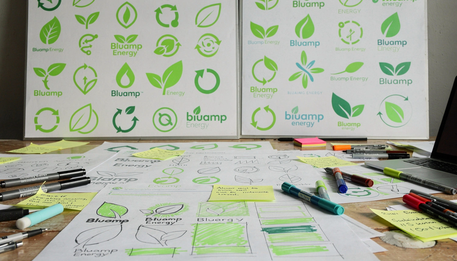
The company had strong technical capability. But its brand presence did not fully reflect that strength. It appeared environmentally aligned – yet visually underpowered. The challenge wasn’t aesthetics. It was alignment.
The Trust Gap
The sustainable energy sector is saturated with identical claims – innovative, affordable, future-ready. When everyone says the same thing, words lose power.
Bluamp’s brand leaned heavily on generic eco cues. While aligned with sustainability, it lacked technical authority. For institutional buyers, that subtle ambiguity creates hesitation. In infrastructure-driven industries, hesitation equals risk. The brand needed to feel dependable before it felt green.
Designing for Risk-Sensitive Decision Makers
The primary audience included infrastructure buyers, commercial project leads, and institutional stakeholders. These are decision-makers who evaluate vendors through the lens of reliability and long-term viability.
They respond to structure. They respond to clarity. They respond to visual discipline. Perception of reliability directly influences purchase confidence.
Design had to reduce uncertainty instantly.
of first impressions are design-related.
In high-investment industries, visual clarity directly influences perceived credibility before a single proposal is reviewed.
of users judge credibility based on visual presentation.
In risk-sensitive sectors like energy infrastructure, perception of stability affects shortlist decisions.
Perception Through Precision
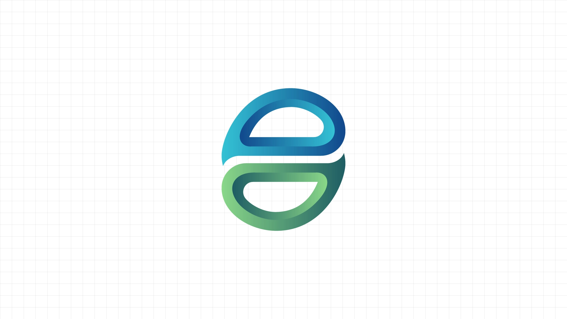
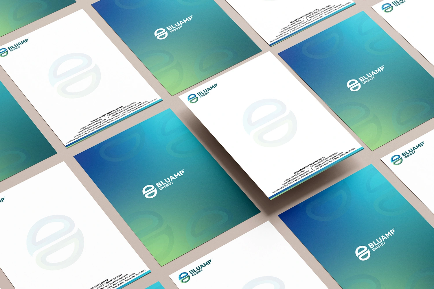
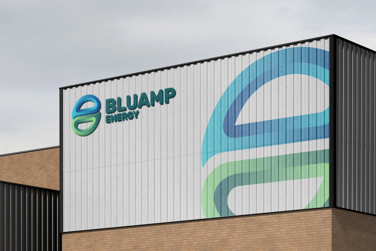
Green alone feels generic in sustainability. The revised palette introduced deep blue tones to reinforce stability and technical credibility.
Blue reduces perceived risk. Green reinforces environmental alignment.
Typography shifted toward strong sans-serif forms with clear hierarchy and disciplined spacing. Legibility was prioritized across documentation and digital platforms. Clarity reduces cognitive load. Reduced cognitive load increases confidence.
Color palette
| Primary #1e5d63 | ◯ |
R 30 |
Fiji Green
| Primary #89d788 | ◯ |
R 137 |
Easter Green
| Primary #11488c | ◯ |
R 17 |
Dark Cerulean
| Primary #34c2d4 | ◯ |
R 52 |
Summer Sky
Typography
Typefase
Rubik Bold
Usage
Headlines
Aà
AaBbCcDdEeFfGgHhIiJjKkLlMmNnOoPpQqRrSsTtUuVvWwXxYyZz 0123456789
Typefase
Montserrat
Usage
Body
Lorem ipsum dolor sit amet, consectetur adipiscing elit, sed do eiusmod tempor incididunt ut labore et dolore magna aliqua. Ut enim ad minim veniam, quis nostrud exercitation ullamco laboris nisi ut aliquip ex ea commodo consequat.
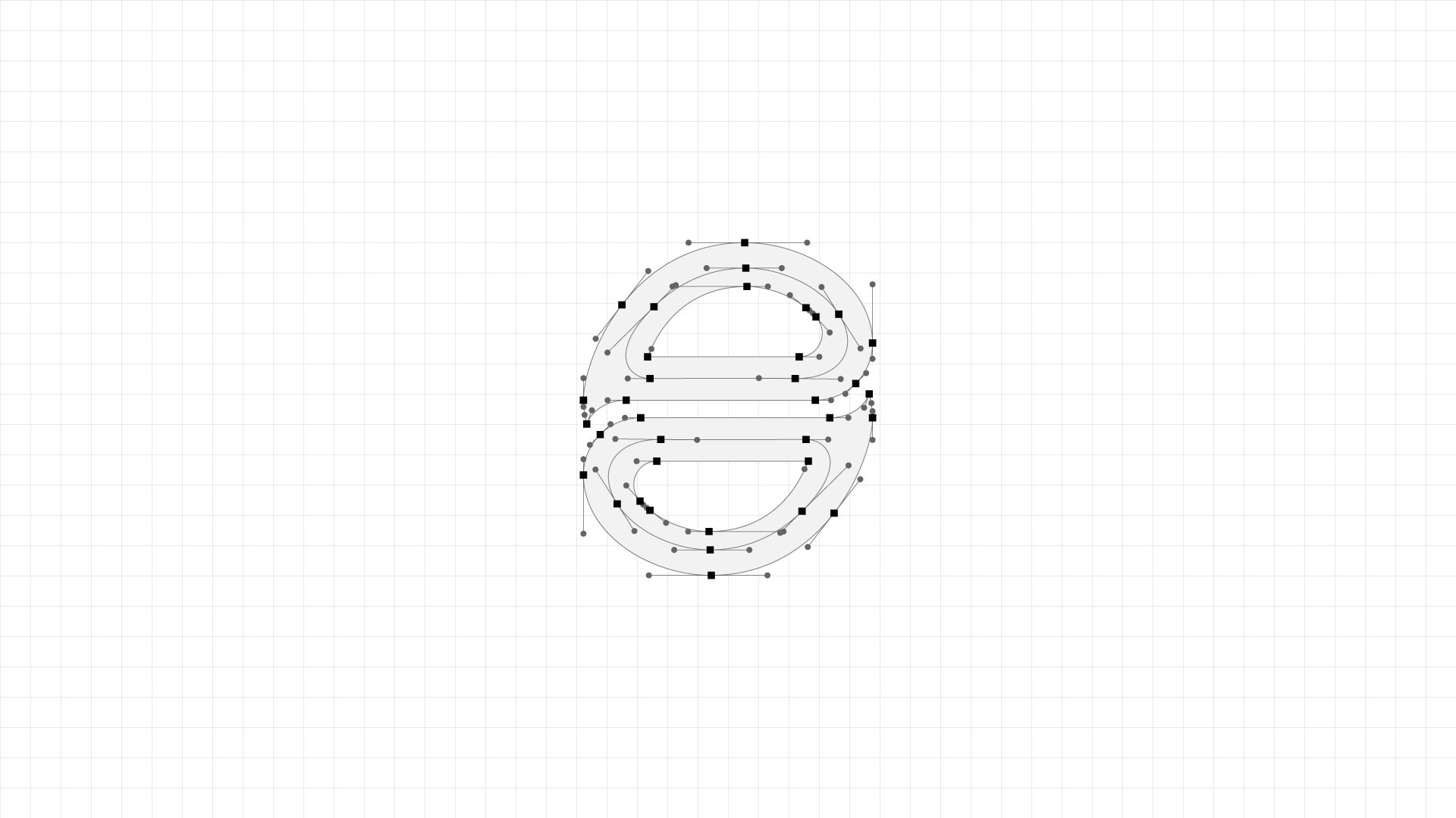
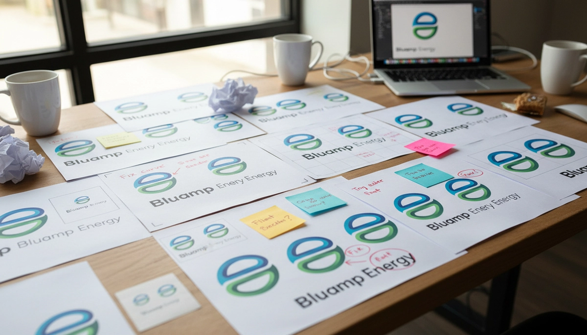
Engineering the Identity
The visual identity adopted stronger geometry and disciplined spacing. Decorative eco motifs were replaced with structured forms.
In technical industries, visual order communicates operational control. The system was built to feel engineered – not styled.
Built to Scale
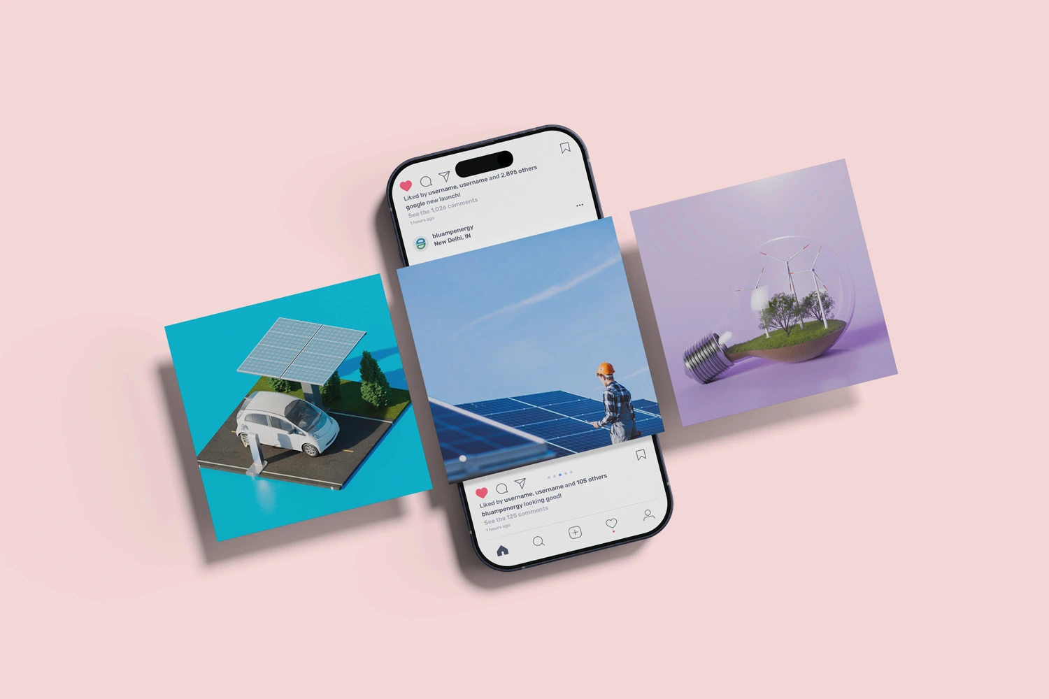
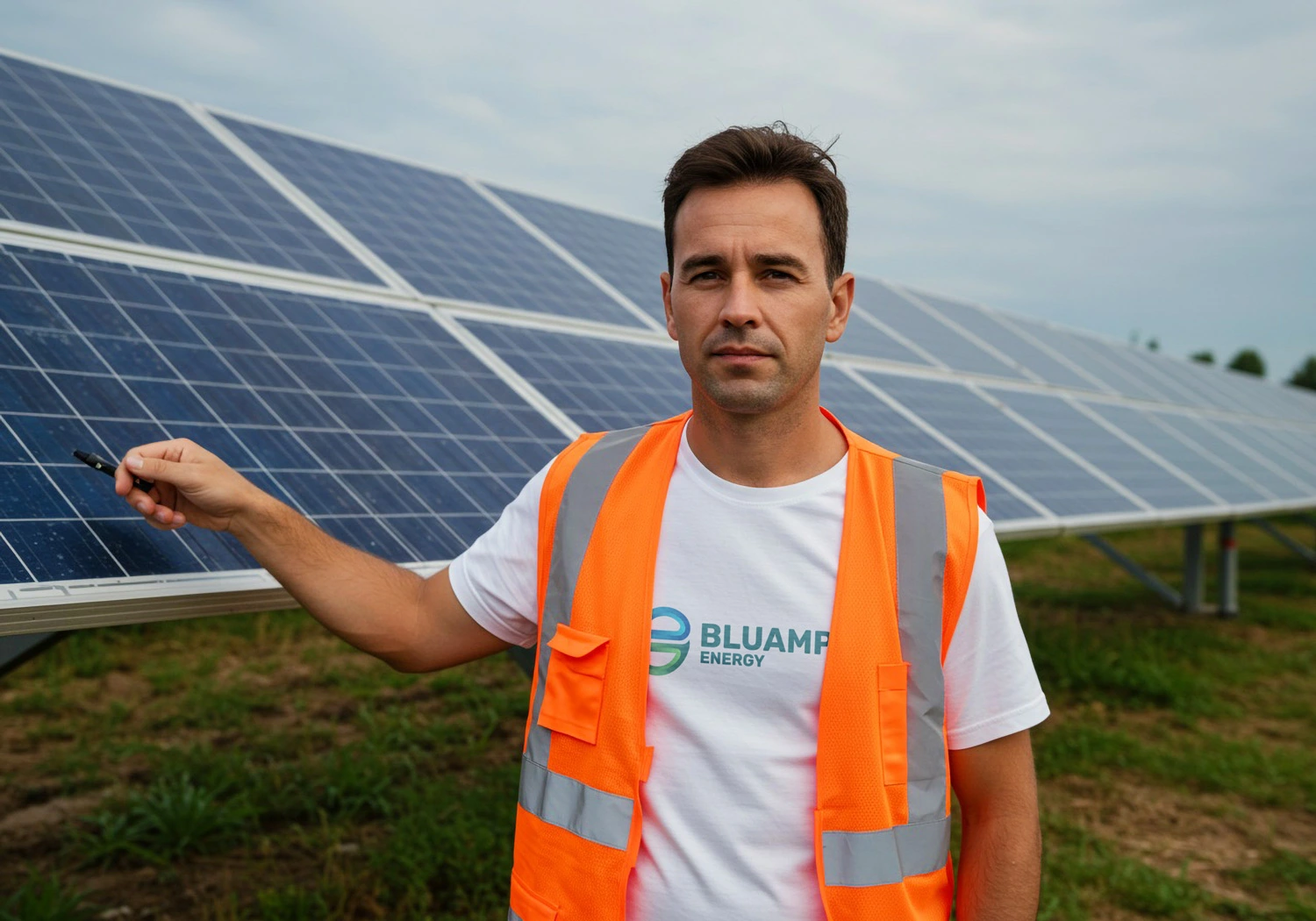
The identity was designed as a scalable system, not a static mark. It extends across packaging, technical documentation, presentations, and digital platforms without losing coherence.
Consistency across touchpoints reinforces reliability. In infrastructure industries, inconsistency signals instability.
What the New System Optimized For
The redesigned identity wasn’t built around aesthetics. It was built around operational signals. Every design decision was optimized to communicate discipline, reliability, and scalability.
00%
Clarity in Communication
Clear hierarchy reduced visual noise across technical documentation and product information.
00%
Consistency Across Touchpoints
The system was designed to scale seamlessly from packaging to presentations without losing coherence.
Scope of Work
Brand Strategy
- Positioning refinement
- Brand narrative alignment
- Value proposition clarity
Visual Identity System
- Logo architecture
- Typography framework
- Color psychology alignment
- Layout & grid logic
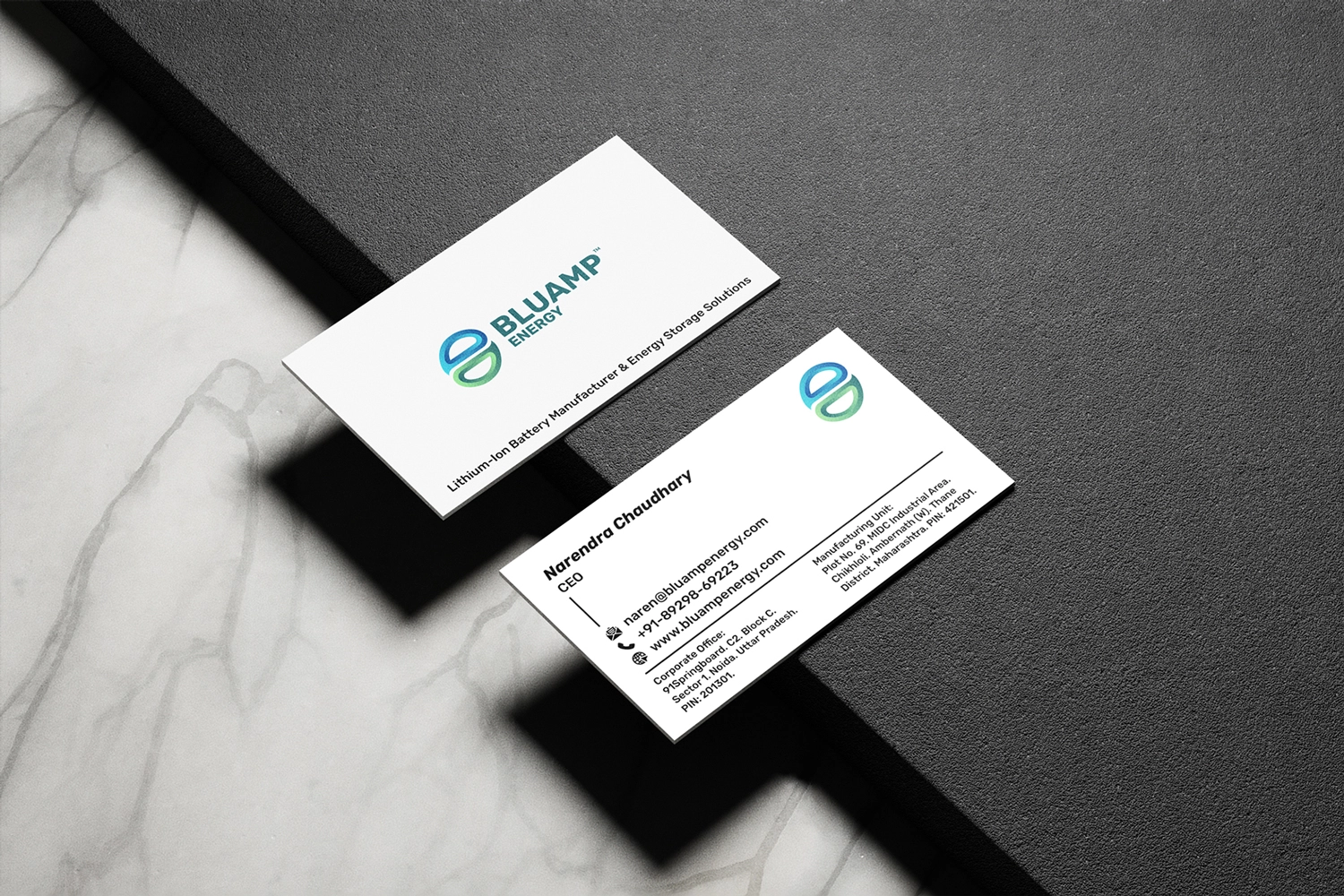
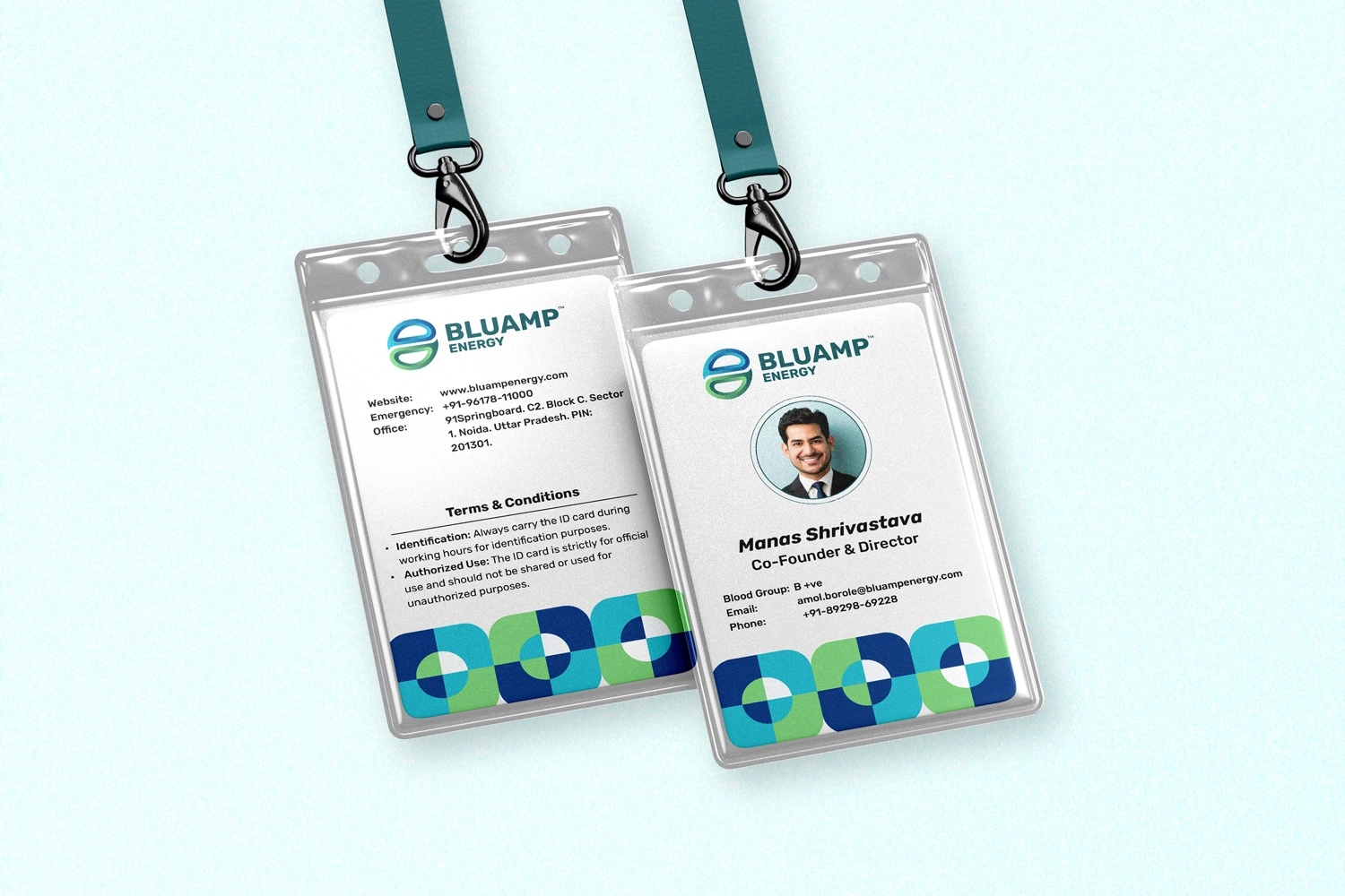
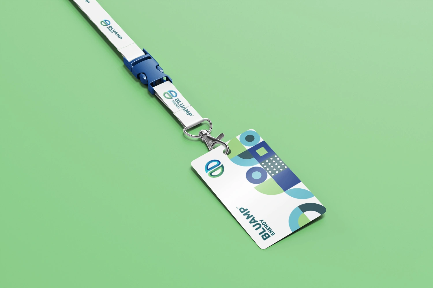
Brand Applications
- Technical documentation
- Packaging system
- Presentation templates
- Digital interface alignment
The Shift in Perception
When a brand communicates technical discipline visually, it reduces friction before a single meeting begins. Post-alignment, Bluamp presented itself with stronger authority. The refined identity improved clarity in sales conversations and reduced ambiguity in product communication.
The brand moved from emerging to established. From expressive to dependable. In risk-sensitive markets, perception directly affects momentum.
Good businesses deserve better visibility!
If yours isn’t communicating that yet, we should talk.